Scatter Plot#
What is a Scatter Plot?#
Scatter plots are a type of graph used to display the relationship between two variables. They are used to show how much one variable is affected by another.
In a scatter plot, each point on the graph represents an observation or data point, and the position of the point on the horizontal (x) axis represents the value of one variable, while the position on the vertical (y) axis represents the value of the other variable.
Scatter plots are commonly used in scientific research, social sciences, finance, and business analytics to help researchers and analysts understand the correlation between two variables, to detect outliers, to identify patterns or trends, and to identify any possible clusters or subgroups within the data.
Getting Started#
To start, you will want to go ahead and import three python libraries: matplotlib, numpy, and pandas.
import matplotlib.pyplot as plt
#plt.style.use('seaborn-darkgrid')
import numpy as np
import pandas as pd
Matplotlib is the library we will be using to create our scatter plots in this tutorial. There are other libraries that we could use to create scatter plots such as seaborn and politely express that come with a variety of advanced features, but for this tutorial, the simplicity of matplotlib will do the trick. As you can see above the style was set to ‘seaborn-darkgrid.’Feel free to change that to whatever you like. Find more styles at Matplotlib: Style Sheet Reference.
Numpy provides the functionality of n-dimensional arrays. Compared to Python lists, numpy arrays save memory usage and provide a variety of benefits for easy mathematical calculations.
Pandas is one of the go-to libraries for data analysis. While it can be used for data visualization, that is not what it will be used for here. Rather it will be used for its Dataframe class to provide structure to the data so that it is more malleable.
Creating a Basic Scatter Plot#
The code below displays a simple scatter chart using lists. The list x will be passed into the matplotlib function as the x parameter as will the y list into the y parameter. It is important that whatever is passed into the x and y parameters have the same shape/length as the other or it will throw an error.
x = np.random.randint(100, size=100)
y = np.random.randint(100, size=100)
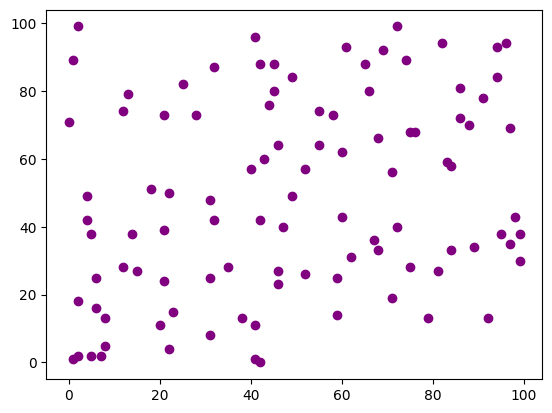
plt.scatter(x,y, color = "purple")
<matplotlib.collections.PathCollection at 0x105ce5910>
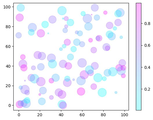
There is also extra functionality we can add to the chart via other parameters. Just as a few examples, you can pass in values to adjust size and color, the alpha parameter adjusts transparency, and the cmap provides a color palette for the chart. If you want to learn more about the different parameters, you can read the documentation here. You can also create a colorbar for the chart by calling the colorbar function from matplotlib.
rng = np.random.RandomState(0)
color = rng.rand(100)
size = 500 * rng.rand(100)

plt.scatter(x, y, c=color, s=size, alpha=0.3, cmap='cool')
plt.colorbar();
Linear Regression in Scatter Plots#
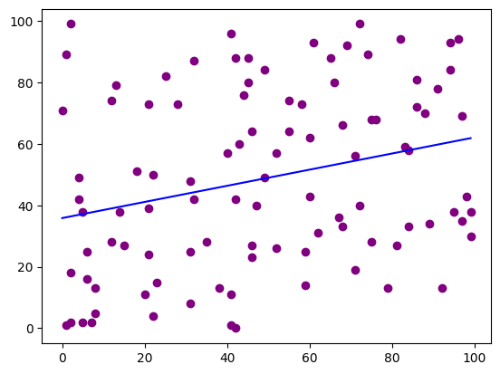
The example above was created randomly. This resulted in having dots spread out across the grid with no meaningful clustering. This would suggest that there is no correlation between the data, which of course is not surprising as the data is completely random. Below is an example using the same data as above, but this time we are using a regression line. Notice how few of the dots are along the line. This allows for easy visualization of correlation or lack thereof in the data.
plt.scatter(x,y, color = "purple")


plt.plot(np.unique(x), np.poly1d(np.polyfit(x, y, 1))(np.unique(x)), color='blue')
[<matplotlib.lines.Line2D at 0x134291d10>]
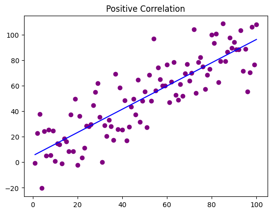
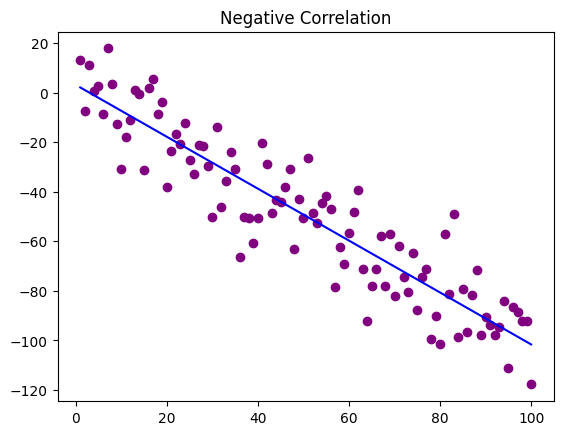
Below is code that creates two scatter plots with data generated to specifically illustrate positive and negative correlation. As you can see with the positive correlation scatter plot as the value increases so does the y. With the negative correlation scatter plot, it is the opposite. As the x value goes up the y values go down.
x = np.arange(1,101)
y = np.random.randn(100)*15 + x

plt.scatter(x,y, color = "purple")


plt.plot(np.unique(x), np.poly1d(np.polyfit(x, y, 1))(np.unique(x)), color='blue')


plt.title('Positive Correlation')
plt.show()

x = np.arange(1,101)
y = np.random.randn(100)*15 - x

plt.scatter(x,y, color = "purple")


plt.plot(np.unique(x), np.poly1d(np.polyfit(x, y, 1))(np.unique(x)), color='blue')


plt.title('Negative Correlation')
plt.show()
Working with Real Data#
Now that we have seen some basic examples, it is time to
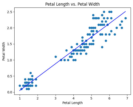
The data in this example will be seeing if there is any correlation between sepal length and sepal width. Start by reading the CSV into a variable using the pandas read_csv function. This will put everything into a dataframe object. The first row will be automatically read in as headers unless specified not to. Make sure to look through the data to get a feel for how everything is laid out.
This data comes from the Plotly github, so just copy the link below and you will be able to use the same data. If you have data you would rather use, feel free to use it. Just make sure to change the path in the data variable.
data = pd.read_csv('https://raw.githubusercontent.com//plotly//datasets//master//iris-data.csv')

data.head()
| sepal length | sepal width | petal length | petal width | class | |
|---|---|---|---|---|---|
| 0 | 5.1 | 3.5 | 1.4 | 0.2 | Iris-setosa |
| 1 | 4.9 | 3.0 | 1.4 | 0.2 | Iris-setosa |
| 2 | 4.7 | 3.2 | 1.3 | 0.2 | Iris-setosa |
| 3 | 4.6 | 3.1 | 1.5 | 0.2 | Iris-setosa |
| 4 | 5.0 | 3.6 | 1.4 | 0.2 | Iris-setosa |
As the dataset is pretty simple nothing has to be done to the data. Below is an example comparing the petal length with the petal width. As you can see there seems to be a trend toward the positive. There in the data between petal length 2-3 and petal width 1.0-1.5
plt.scatter(data['petal length'], data['petal width'])
plt.xlabel('Petal Length')
plt.ylabel('Petal Width')
plt.title('Petal Length vs. Petal Width')

plt.plot(np.unique(data['petal length']), np.poly1d(np.polyfit(data['petal length'], data['petal width'], 1))(np.unique(data['petal length'])), color='blue')
plt.show()
Acknowledgments#
This notebook includes contributions and insights from Patrick Wolfe, MLIS graduate, 2023.